Campfire Branding
Brand Development · Visual Identity · Collateral Design
Maiello Cello
-
Graphic Designer / 2026
Logo design and initial creative direction by Campfire Branding’s Creative Director. I collaborated on the development and refinement of the supporting visual system.
-
Brand Development, Brand Guidelines, Print, Digital & Environmental Design
-
Working alongside Campfire Branding’s Creative Director, I contributed to the development of Maiello Cello’s visual identity from early exploration through the creation of the final brand system. Building from initial logo concepts developed by the Creative Director, I helped further refine and expand the identity through logo development, custom iconography, supporting graphic elements, and brand applications.
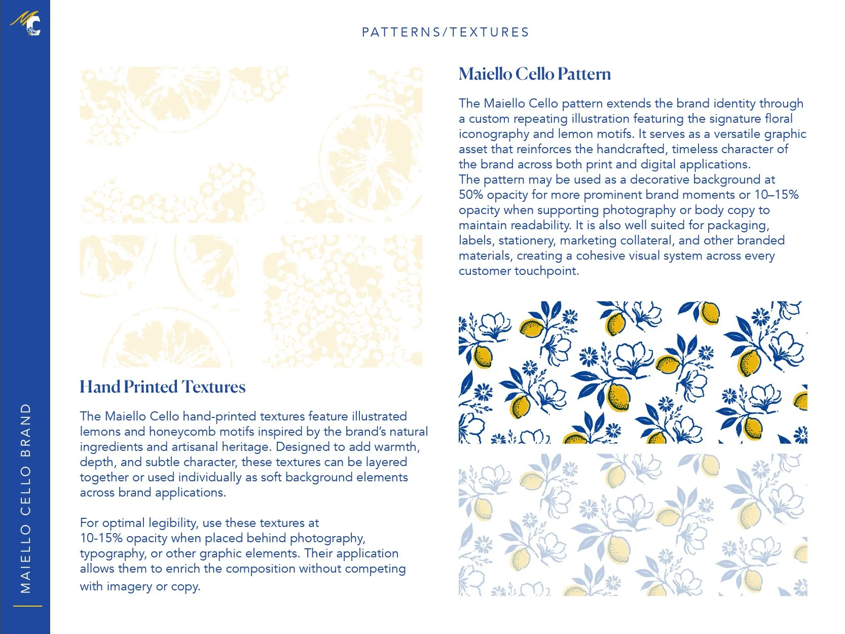
I also collaborated on the development and design of the brand guidelines, helping translate the evolving identity into a cohesive visual system. Throughout the process, I explored additional creative directions through hand-drawn illustration, printmaking, poster design, and pattern development. While some of these explorations remained conceptual, select hand-printed textures were incorporated into the final identity and brand guidelines, bringing a tactile, handcrafted quality to the finished system.


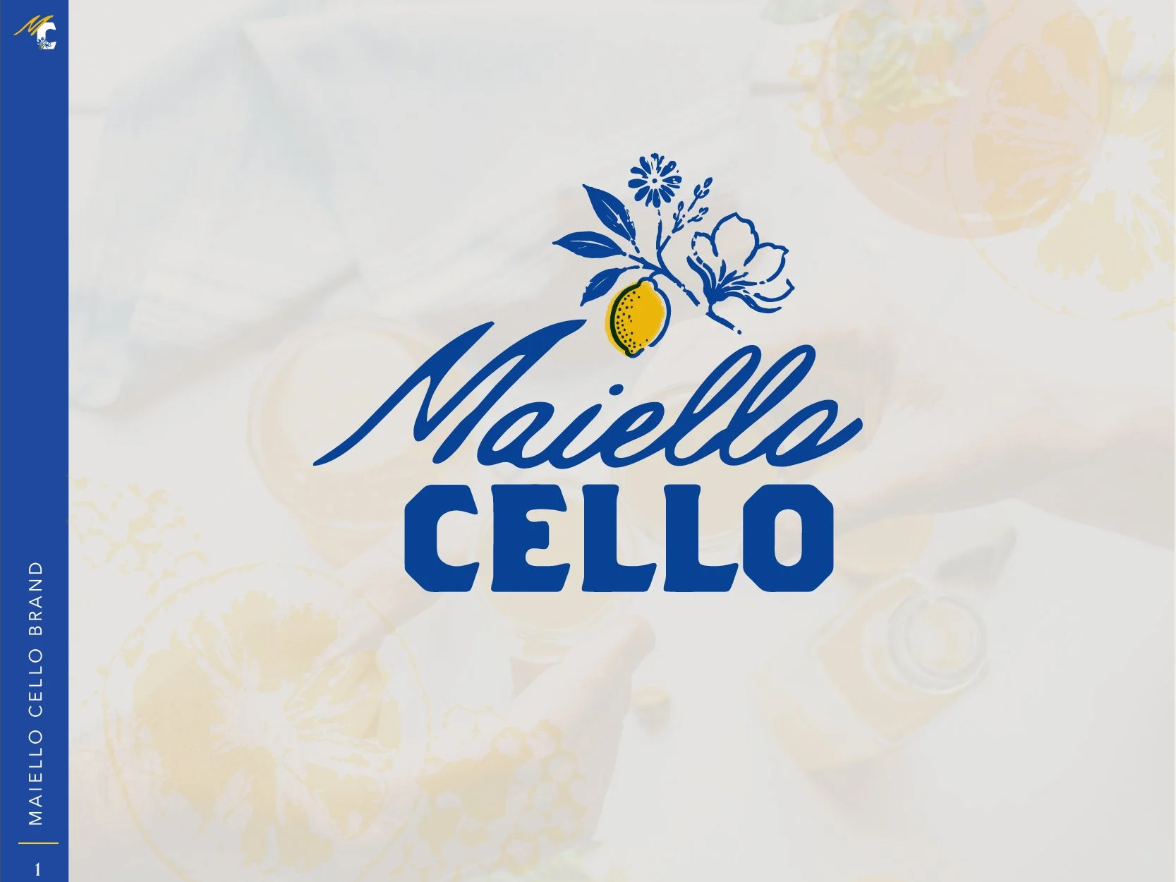
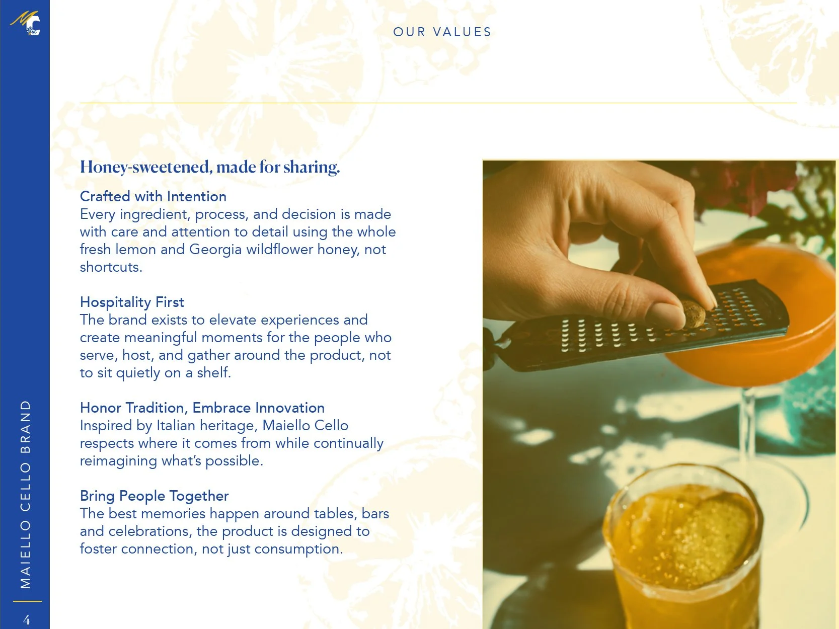
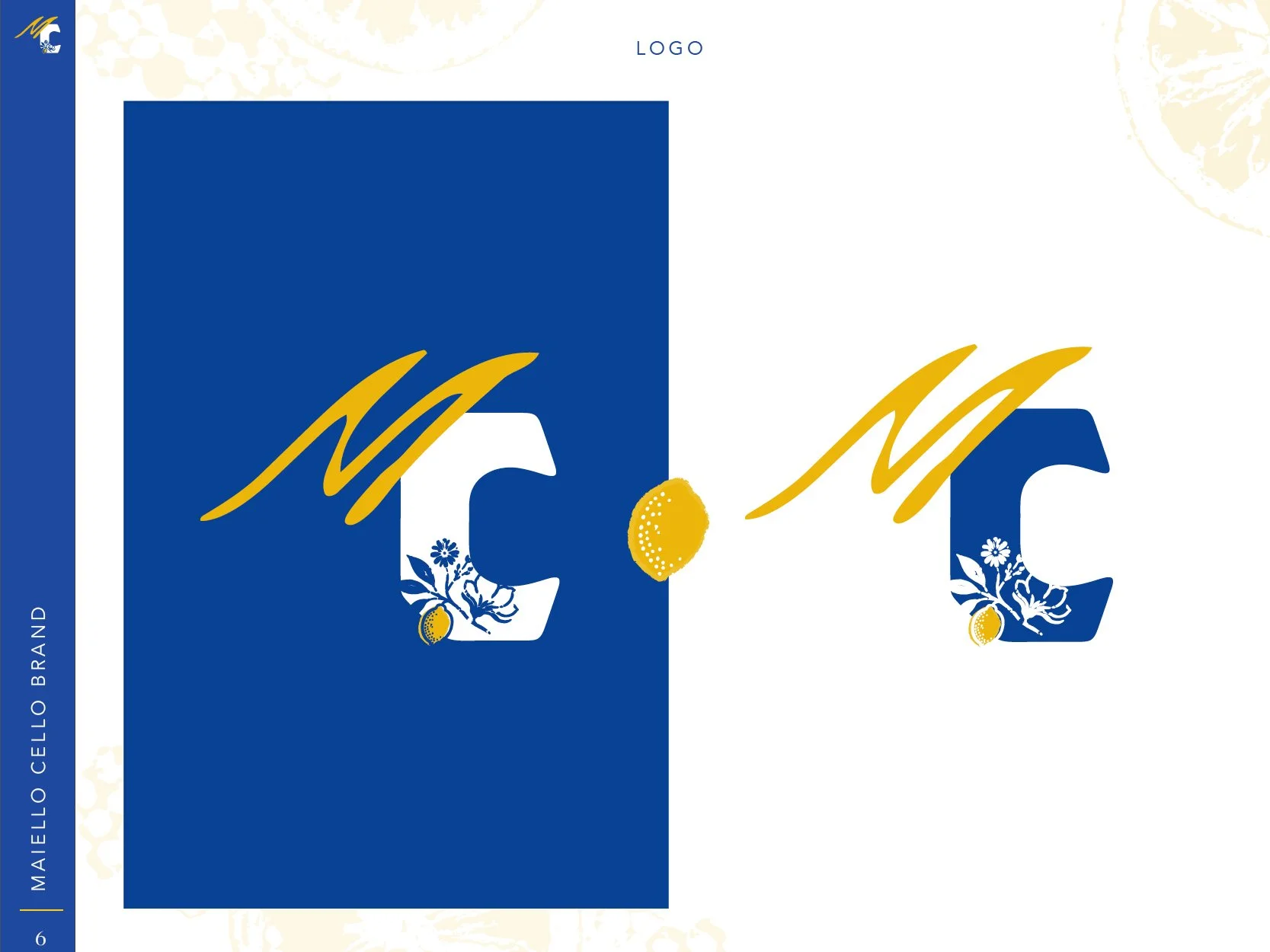
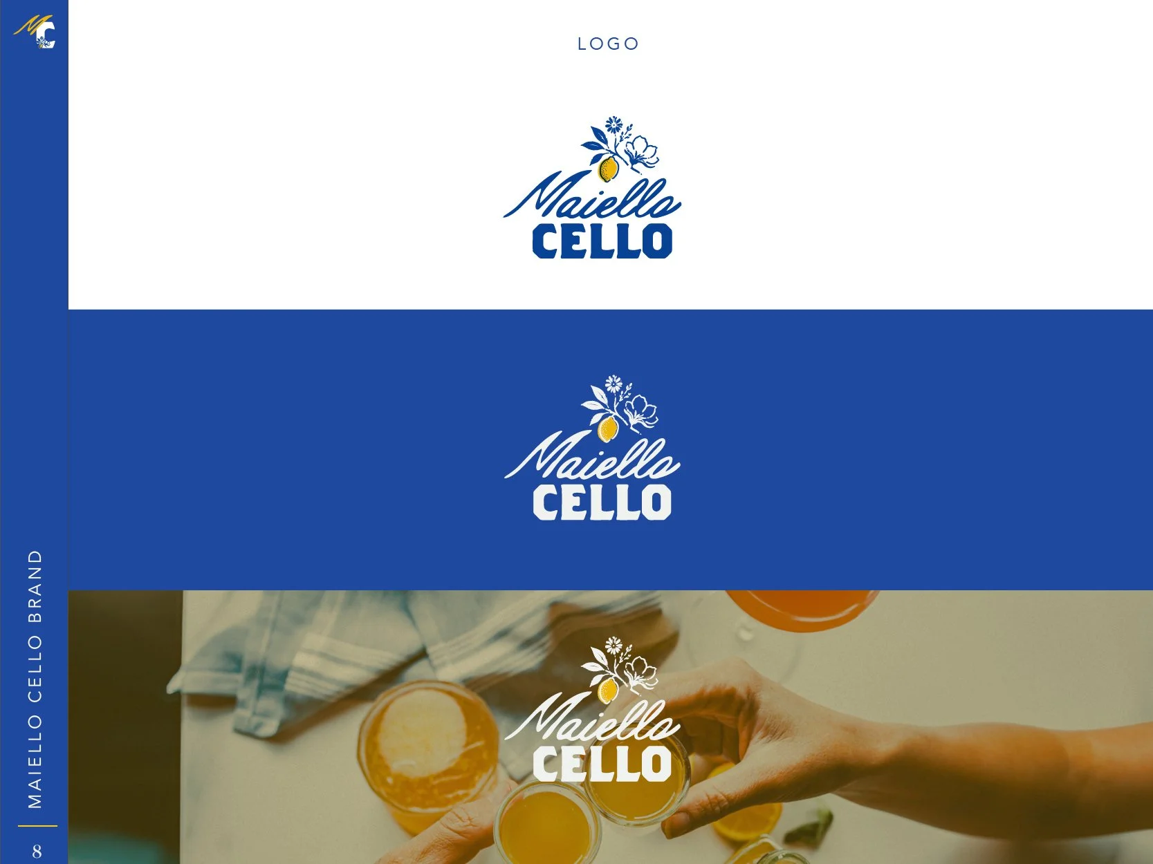
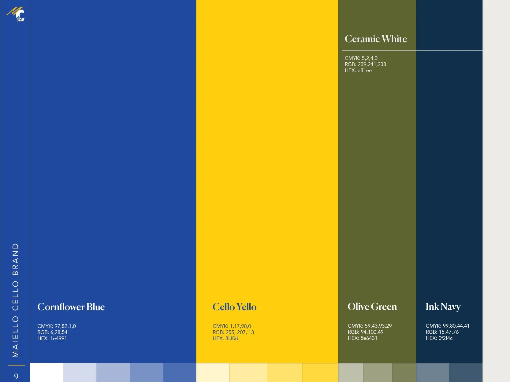
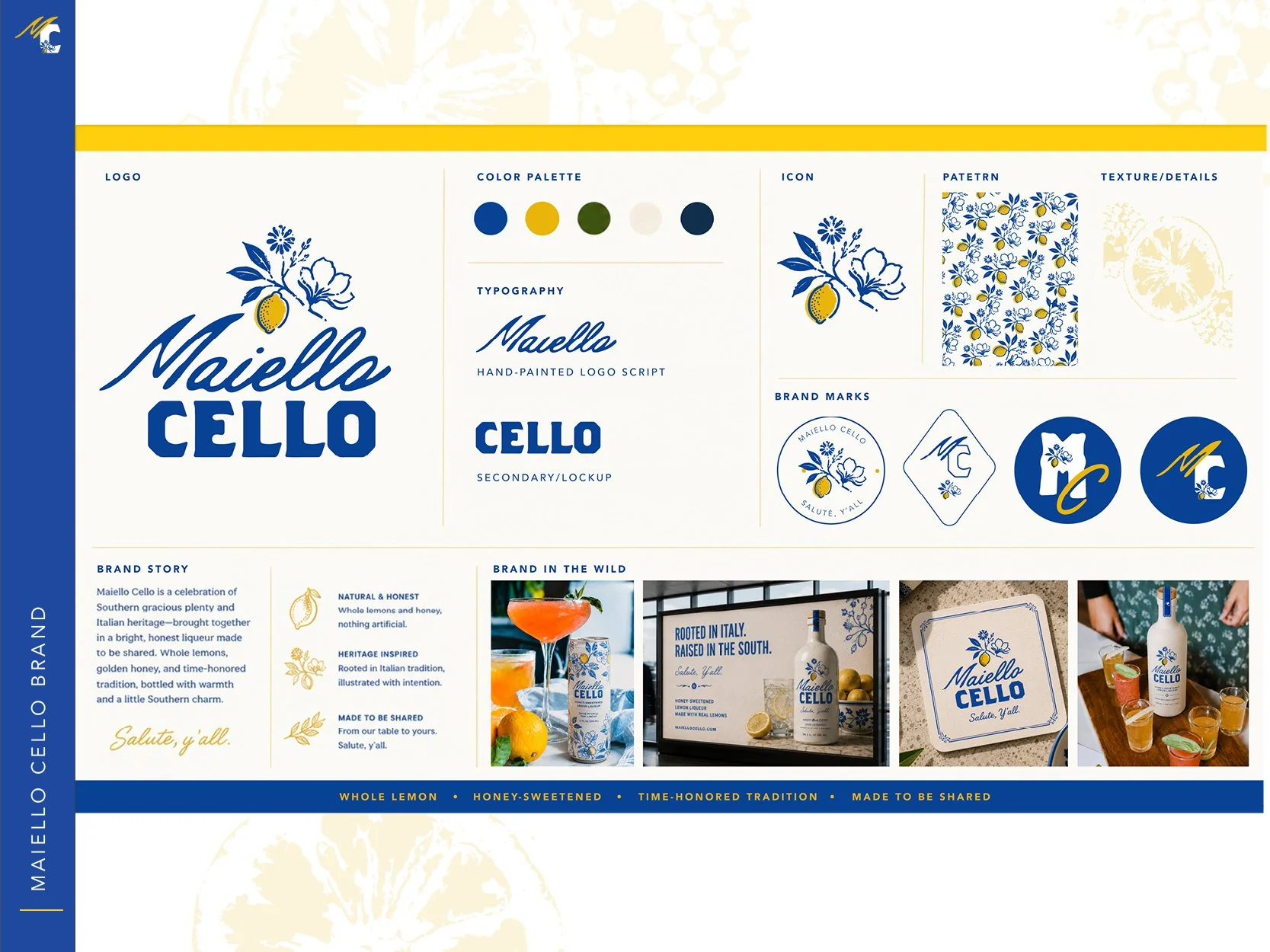
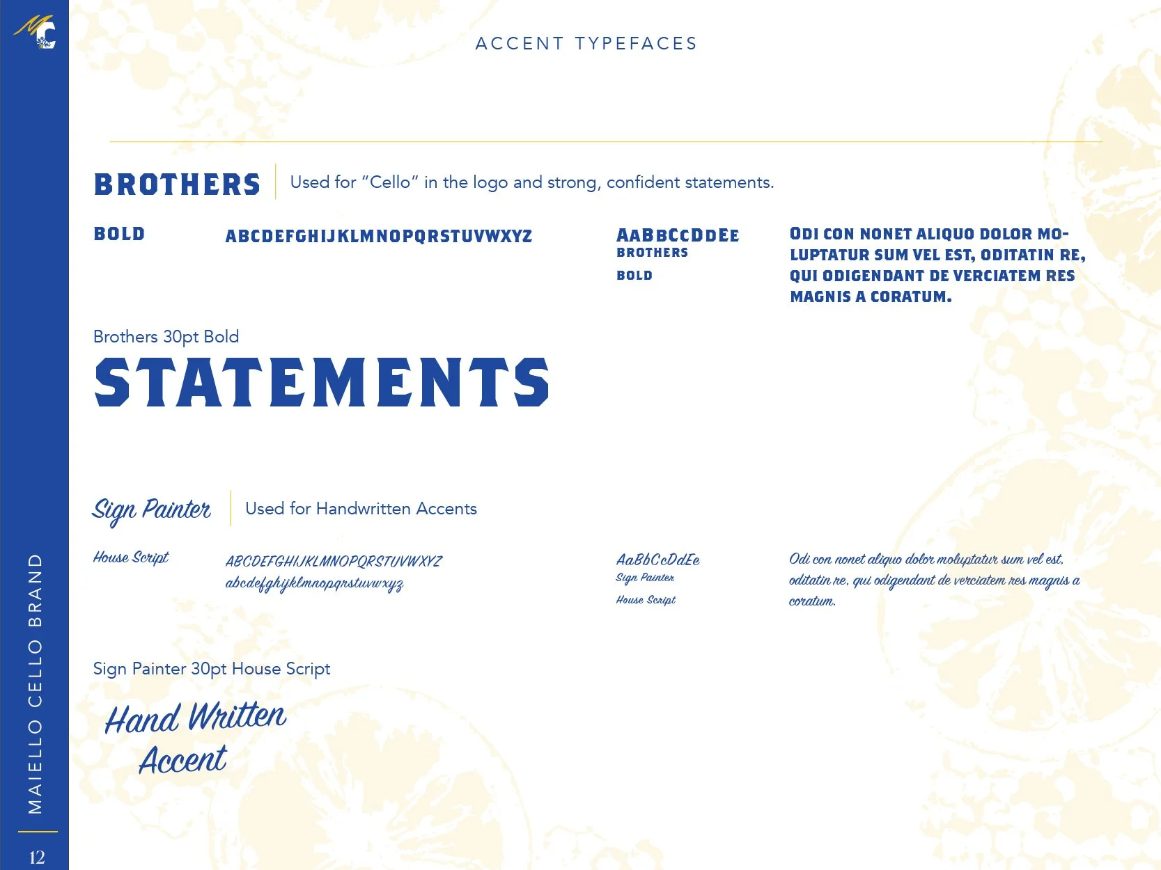
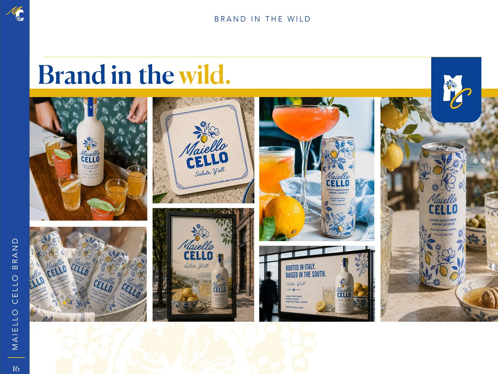
A selection of pages from the final Maiello Cello brand book, showcasing the visual system in application. The guidelines bring together the refined logo suite, custom iconography, typography, color, and supporting graphic elements to create a cohesive and expressive brand identity.
Brand Book Highlights.
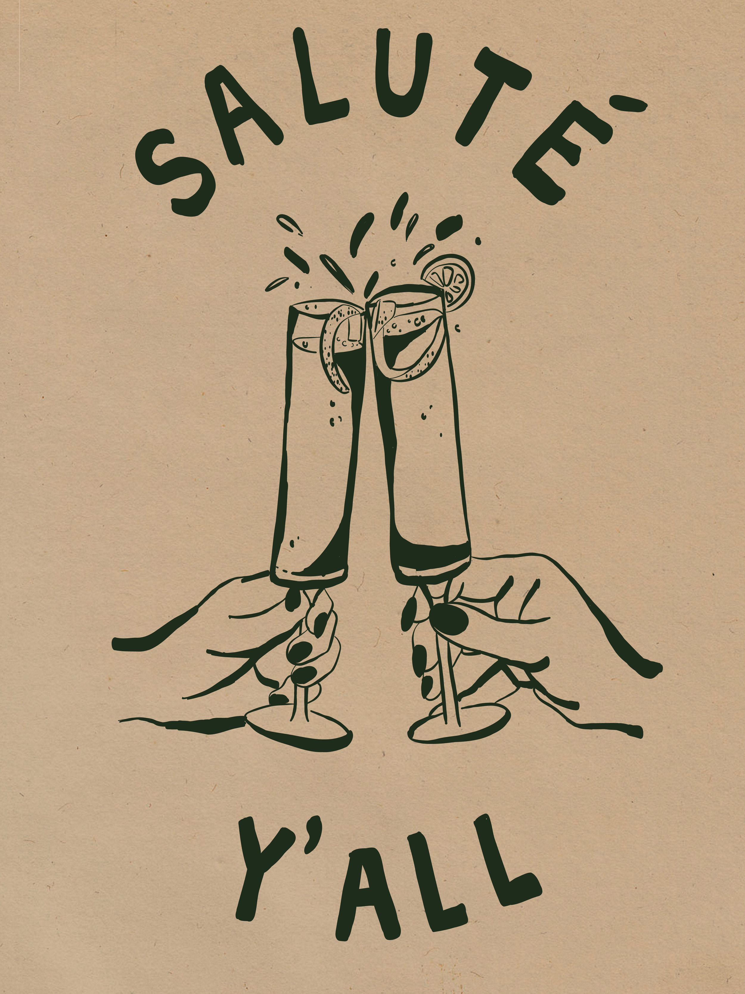
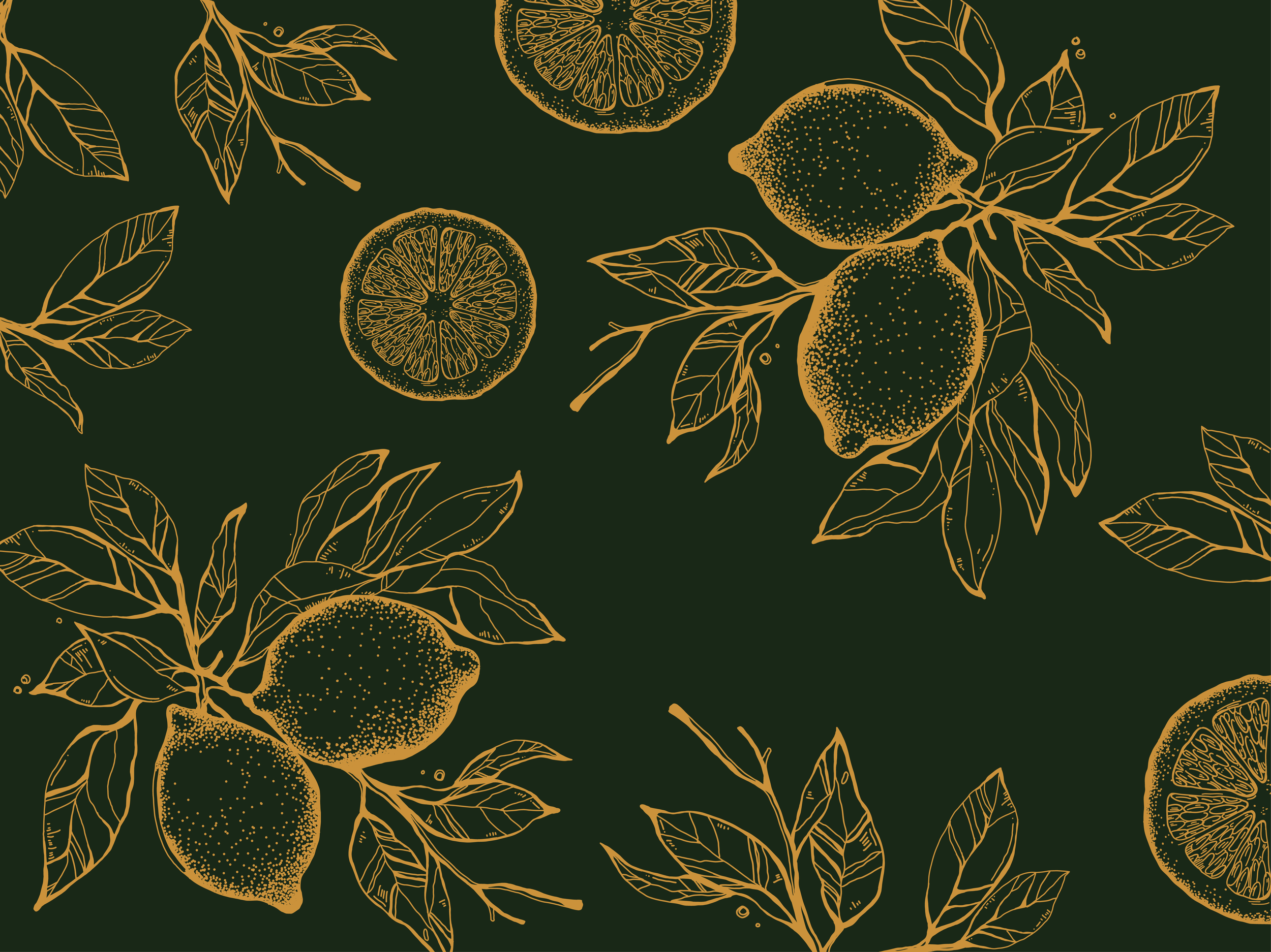
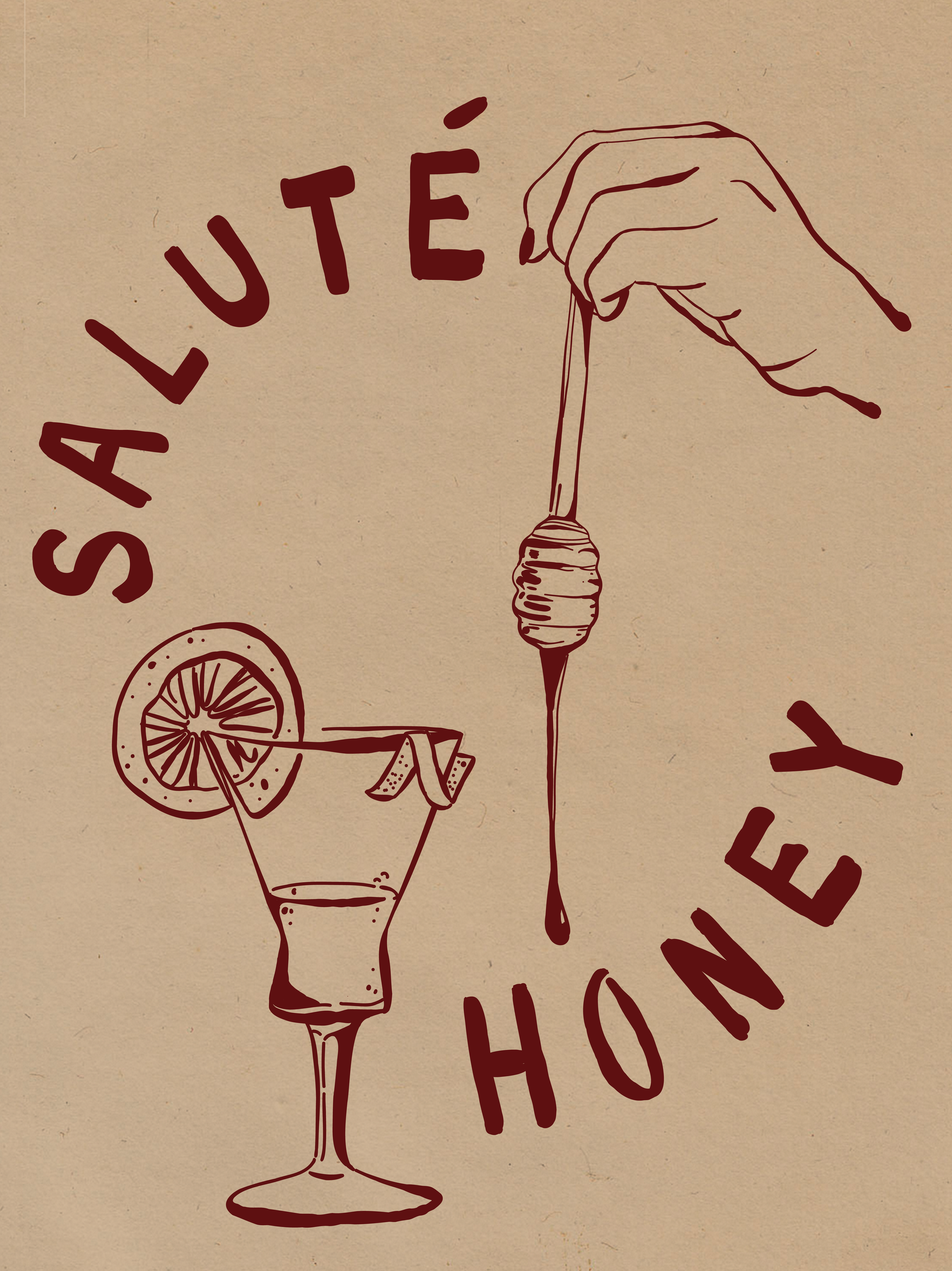
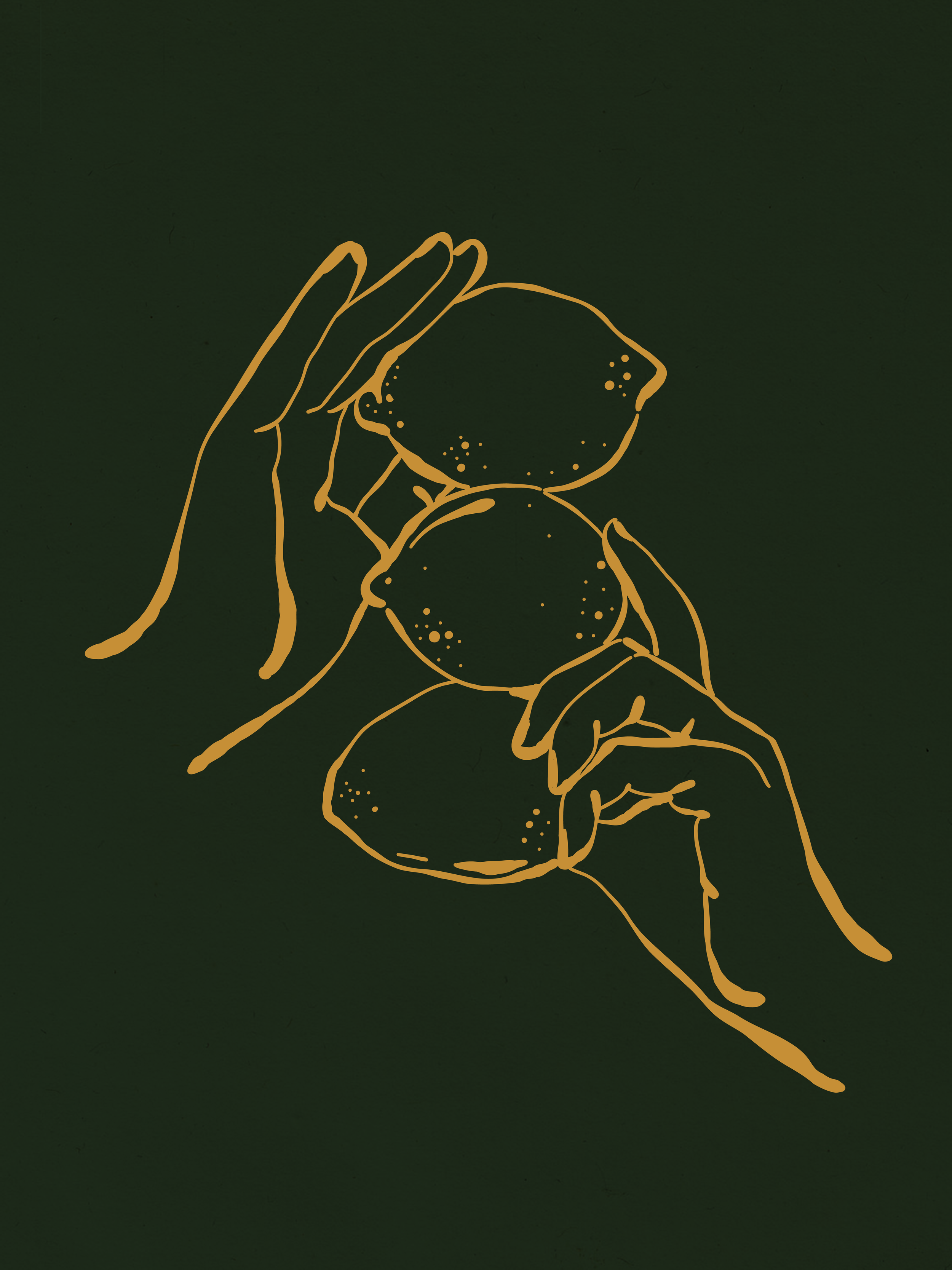
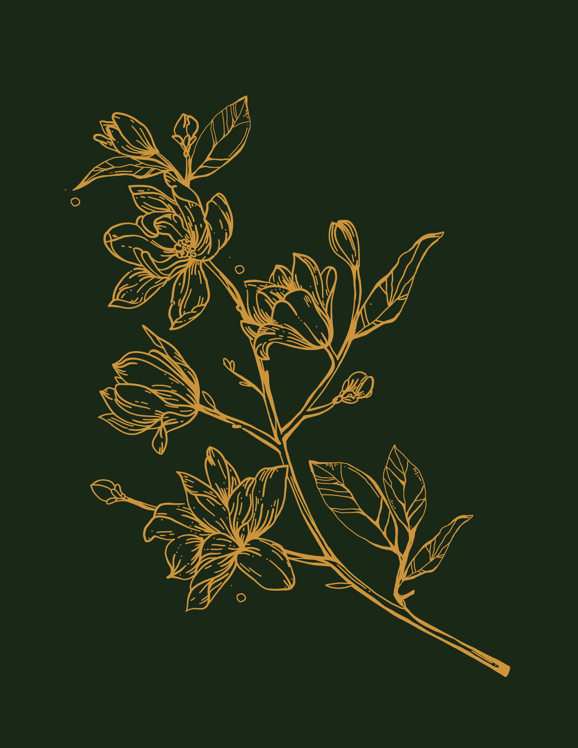
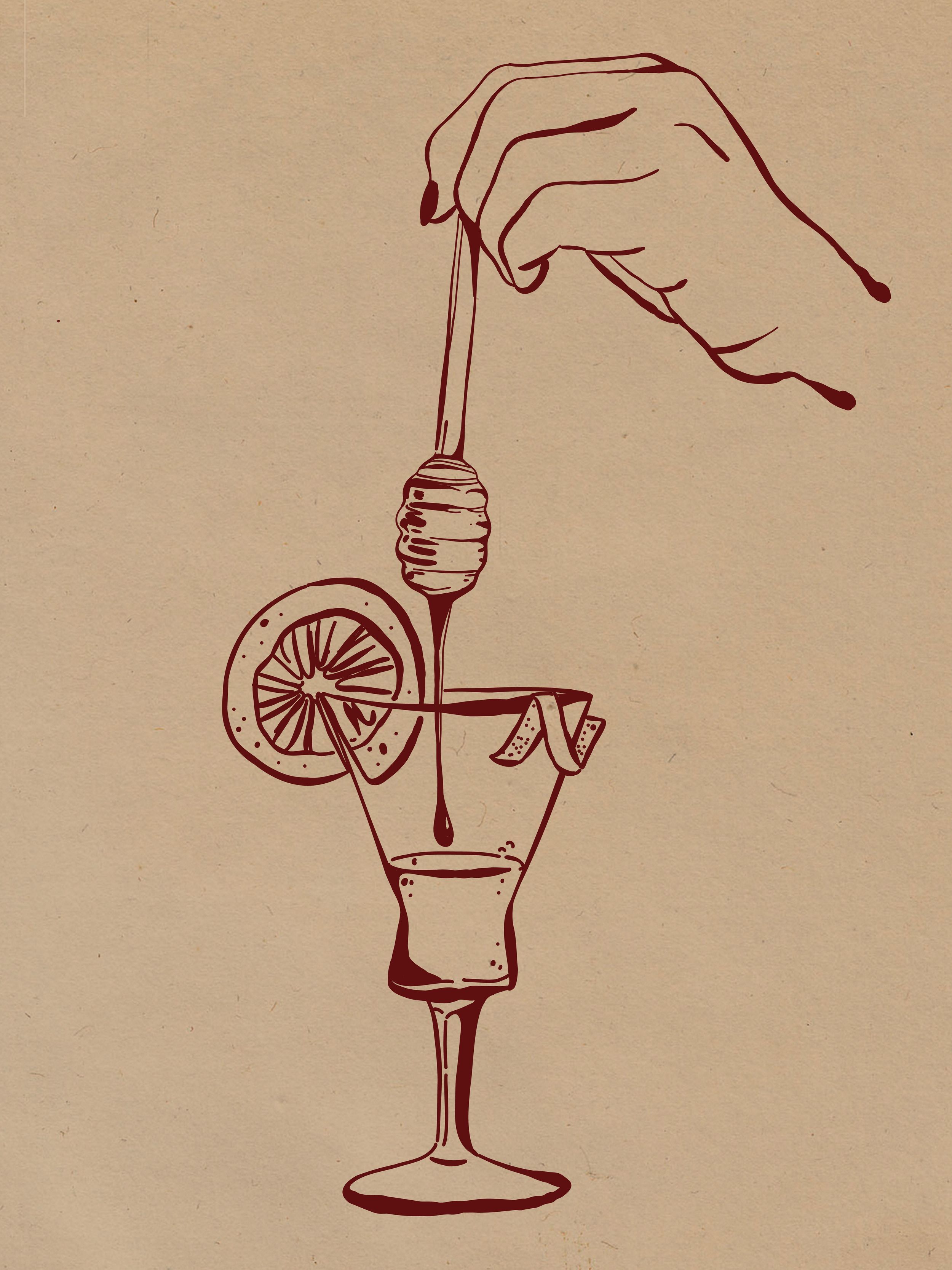
This phase of the project explored a more tactile, handcrafted side of the Maiello Cello identity through original illustration and printmaking. Hand-drawn lemons and florals were developed into repeating patterns, while vintage Italian poster-inspired illustrations explored the nostalgic character and heritage behind the brand.
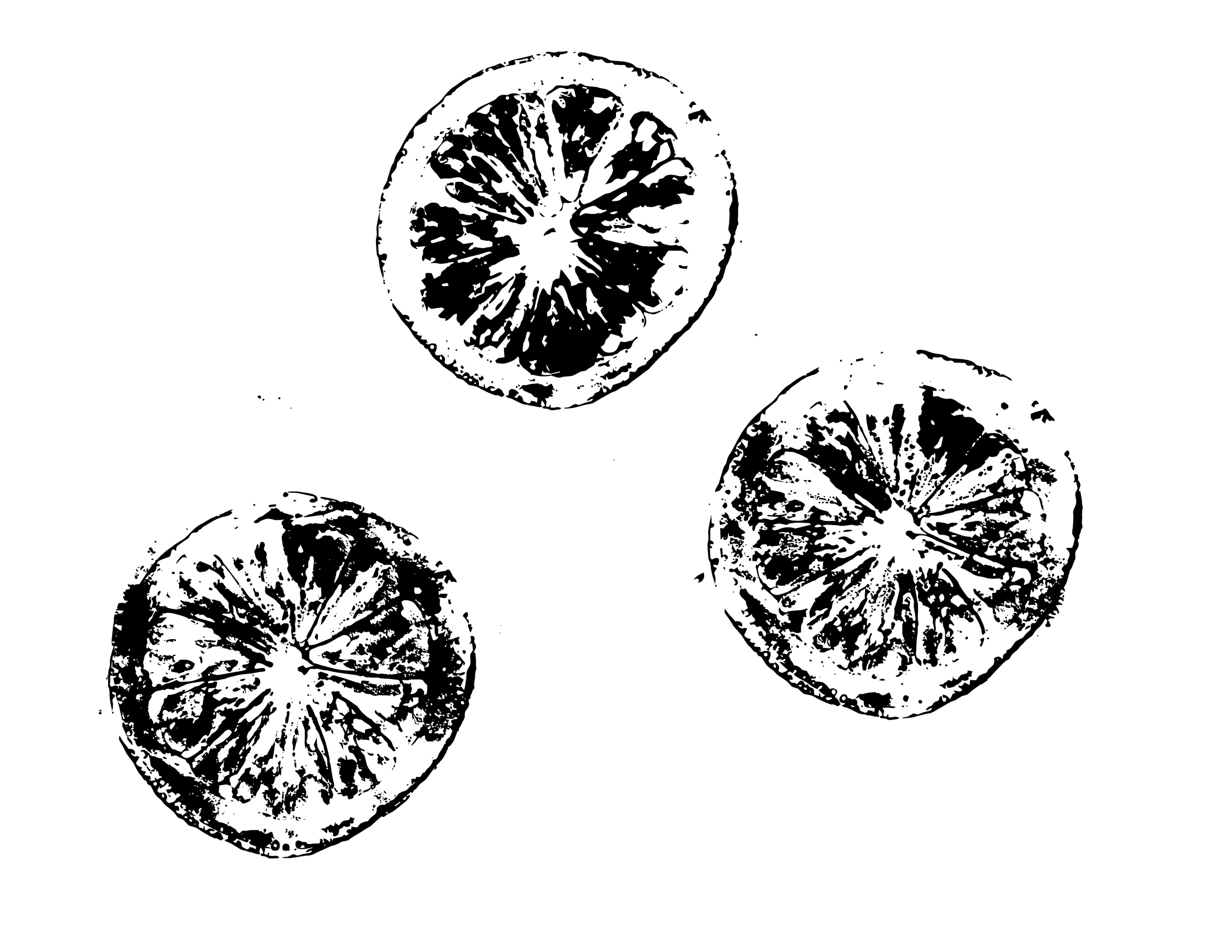
Alongside these illustrative concepts, I created a series of hand-printed textures that became part of the final Maiello Cello visual language. These textures were incorporated throughout the finished identity and brand book, adding an organic, imperfect quality that complements the brand’s handcrafted character.
Handcrafted Explorations.
Carine
-
Graphic Designer / 2026
Logo design and initial creative direction by Campfire Branding’s Creative Director. I collaborated on the development and refinement of the supporting visual system.
-
Brand Development, Brand Guidelines, Print, Digital & Environmental Design
-
Working closely with Campfire Branding’s Creative Director, I collaborated on the development of Carine’s visual identity and design system, helping establish a cohesive visual language around the brand’s logo. I then worked alongside the Creative Director to develop and finalize the brand book, translating the identity into clear guidelines for consistent use across applications.
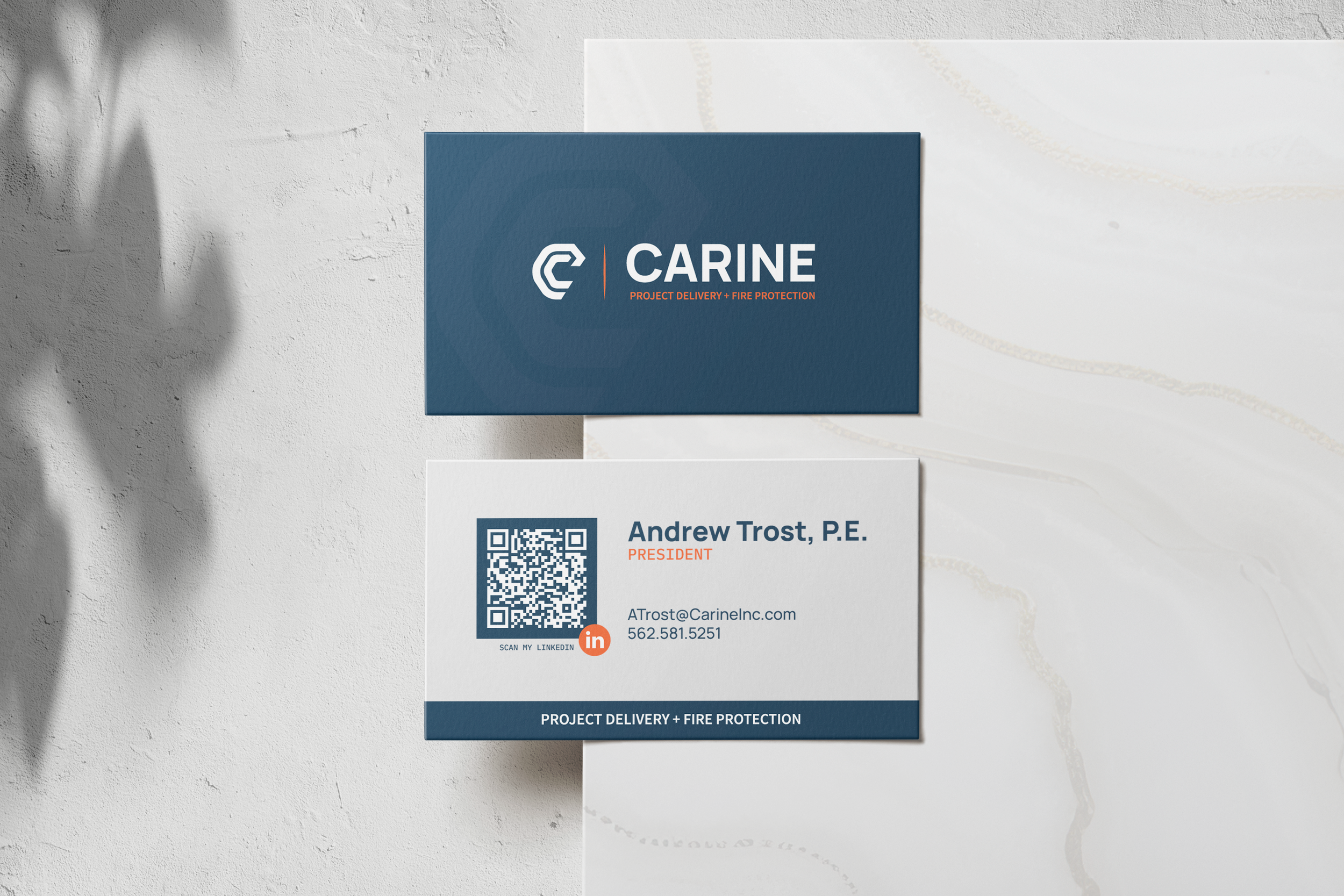
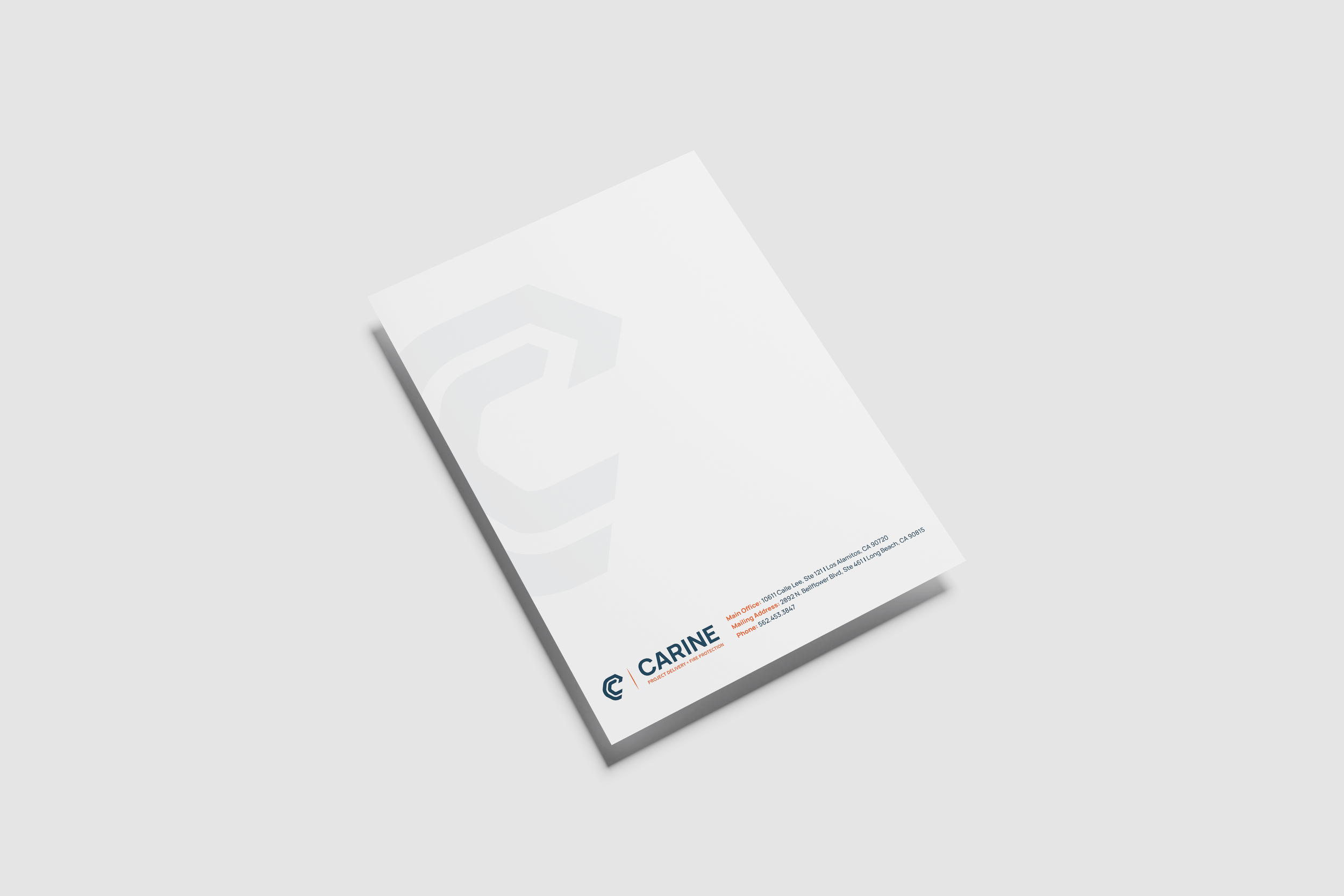
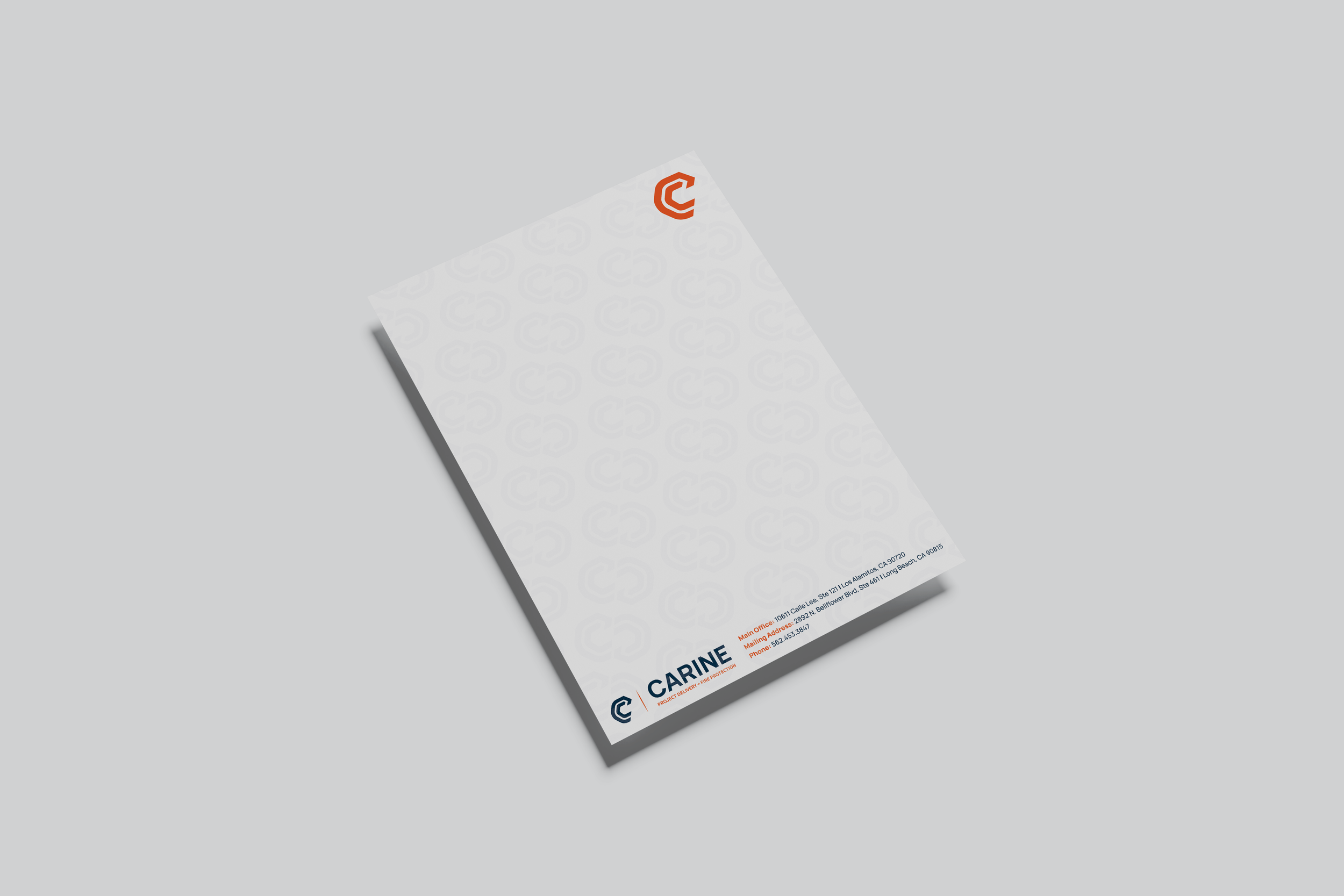
From there, I helped extend the system across a comprehensive range of brand touchpoints, including business cards, letterhead, email signatures, Microsoft Teams backgrounds, conference graphics, office signage, door vinyl, visitor materials, and other branded communications.
The result is a flexible and cohesive brand system designed to maintain a consistent visual presence across digital, print, and physical environments

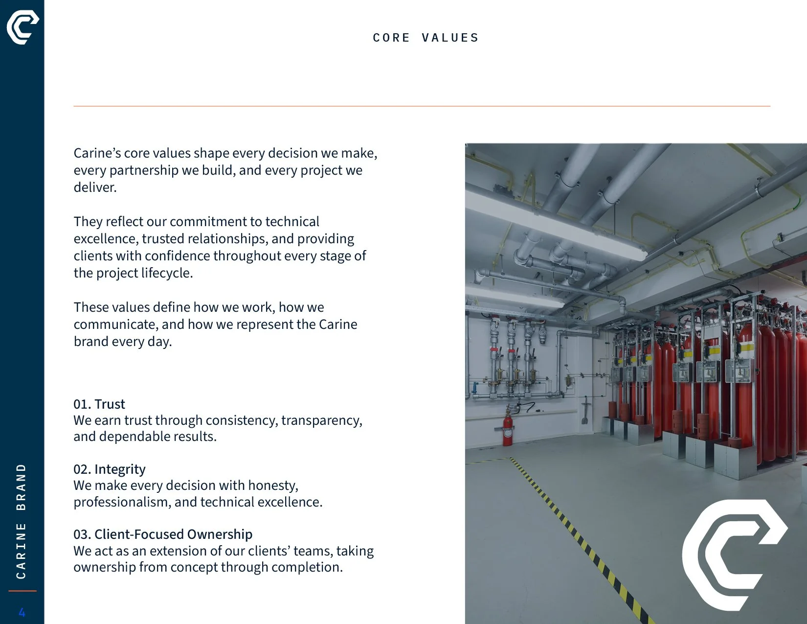
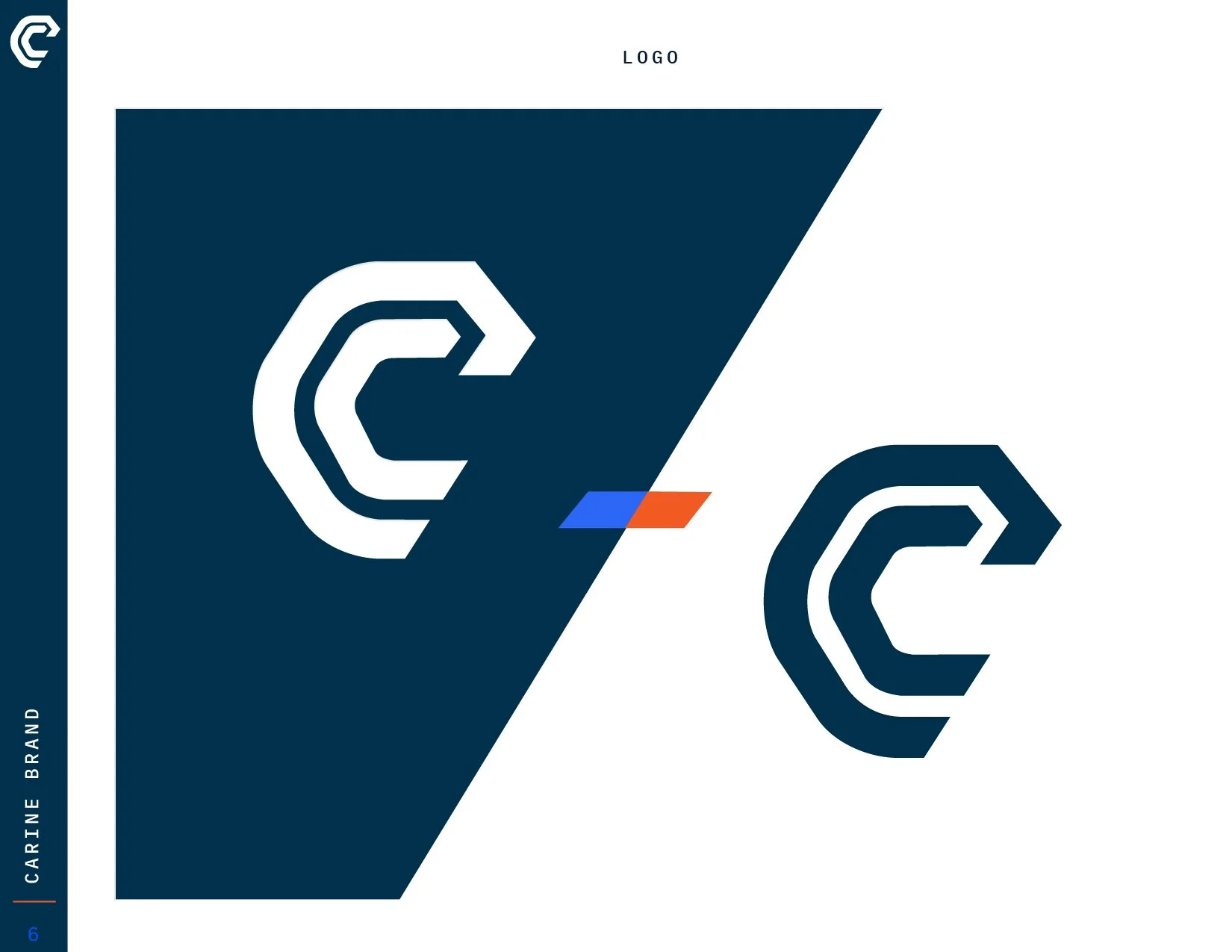
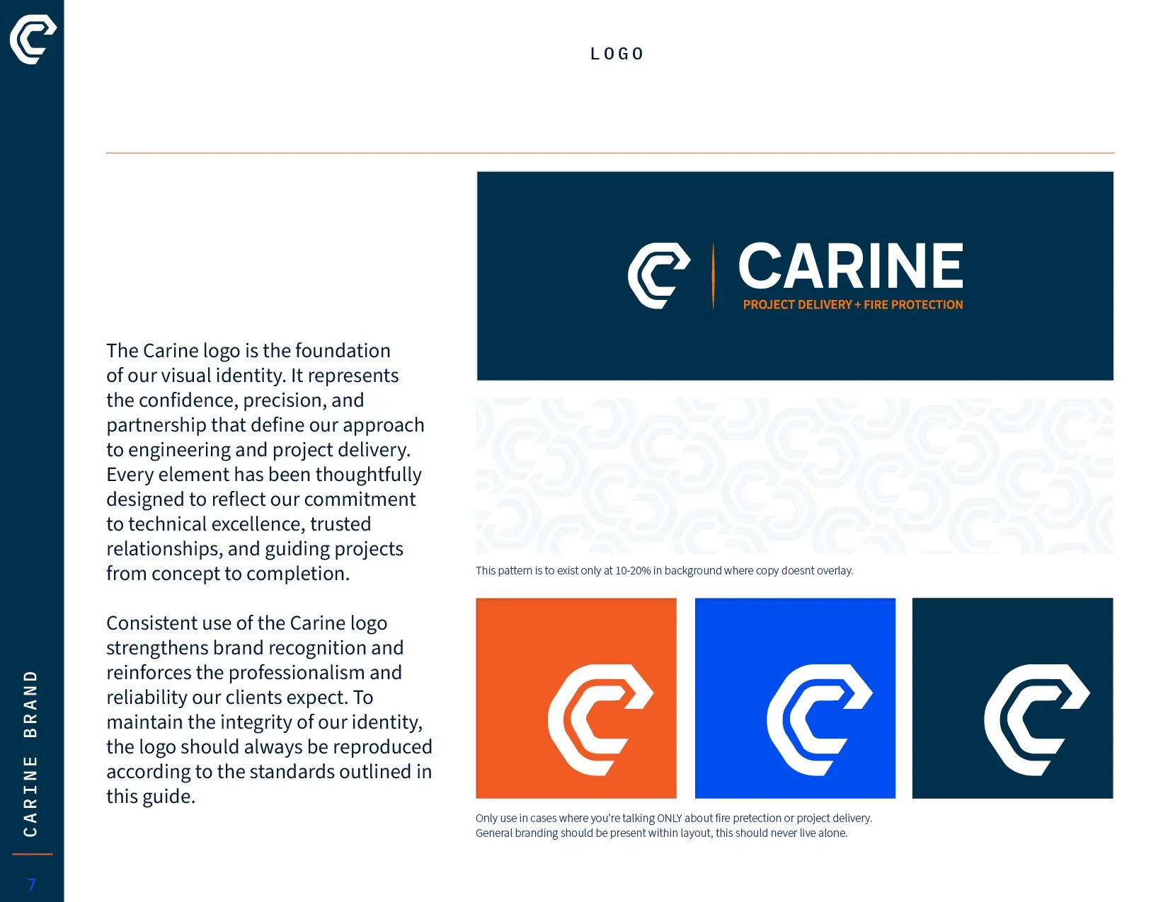
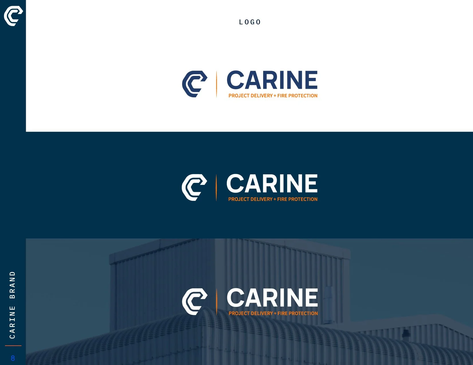
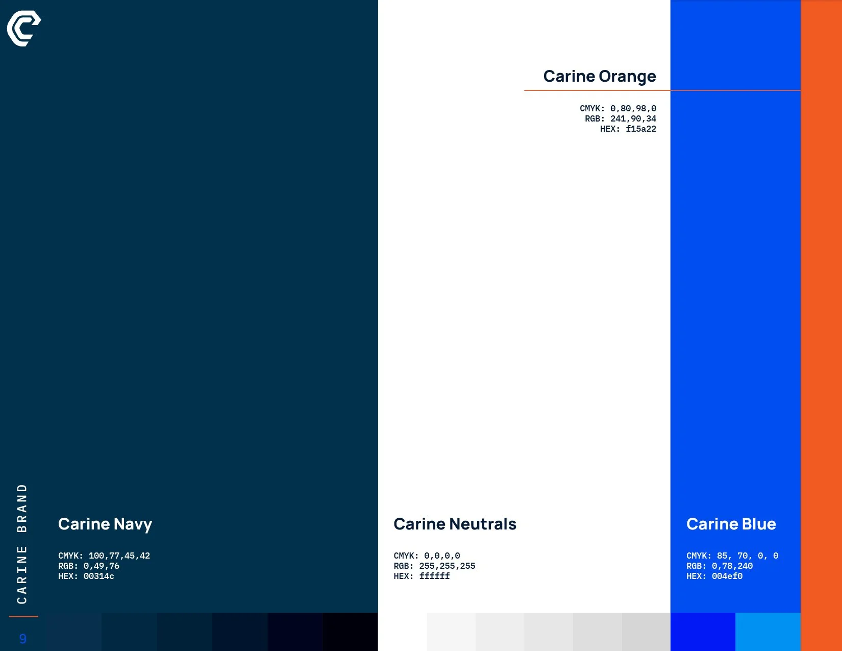
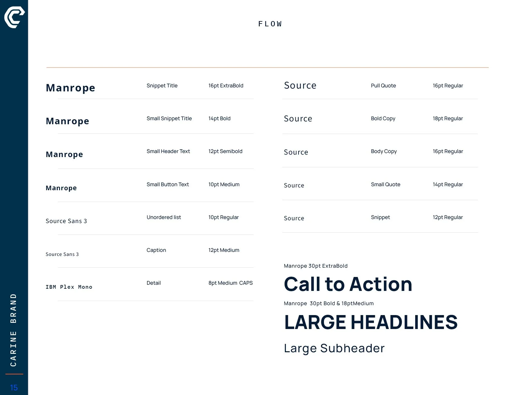
Developed in collaboration with Campfire Branding’s Creative Director, translating the visual identity into a cohesive system of typography, color, imagery, iconography, and application guidelines.
Brand Book Highlights.


Custom Icons




Using the established brand system, I designed and developed a range of print, digital, and environmental applications, including stationery, digital templates, conference graphics, signage, and branded office materials.